Illustrator - PDF (Fonts must be outlined, file in RGB)
Word, Excel, Power Point etc - Save as PDF
Canva - Save as 'Print PDF'
Resolution
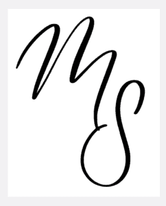
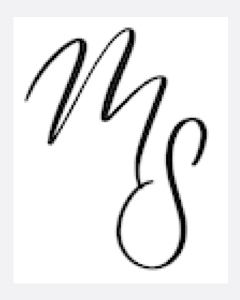
We want you to have a the best quality imprint. IDEALLY a PDF (vector) image will get you the best results however we do accept raster images as well (png, jpg) but they have to be high resolution. We need a high resolution image file (at least 600 DPI). The image on the right has a ‘staircase effect’ and this will transfer over to the stamp if a file like this is used. A crisp image like the example on the left is ideal. You cannot scale up a raster image (jpg, png files). The only way to make a poor quality image better is with the original vector file (sometimes pdf, or illustrator file).
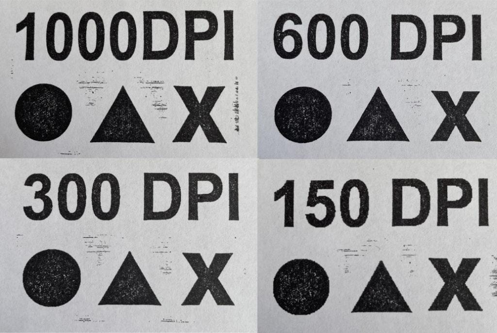
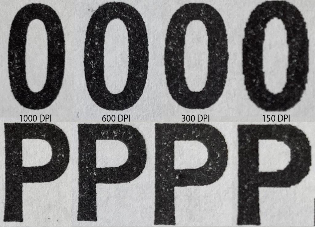
You can see in the samples below, the difference between lower and higher resolutions. At 150 & 300 DPI you can see some jagged edges. The curves and lines become much smoother in 600 & 1000 DPI.
Quick Guidlines
Smallest font size is approx 7 pts
Minimum line thickness is 0.2mm (all lines of the font, serif fonts have a thin and thick side)
Minimum space between lines/inked objest is 0.2mm
Ideal Font Styles & Sizing
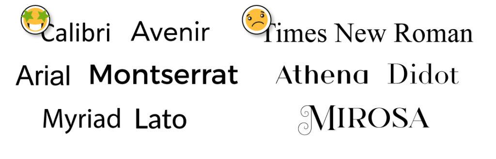
To get the best impression, we suggest an even and consistent font. Usually the thin lines shown in the fonts on the right won’t ink properly, especially on a self inking style stamp. Rubber stamps are a little more forgiving but it’s still risky. If you have your heart set on a font like the ones on the right, you will need to be ordering a large size stamp but if you need a smaller stamp we will have to thicken it so the thinnest line will show (which will make the thicker lines even thicker).
When your font size is too small you will see the ink collecting in the very small openings of your letters. This is why we recommend at least a 7 pt font size. If you are using a very bold font, make sure the letters are spaced out enough so they don’t touch and cause blobbing/bleeding.